Introduction
Global tourism is a booming industry. It remains resilient and proves that the market continues to grow with solid growth statistics. According to a World Travel & Tourism Council estimate, the travel industry generated 10.4% of the world’s GDP in 2019, continuing its long history of solid GDP contributions. The on-demand economy has changed people’s perceptions of many things, such as travel & hospitality. The travel sector is still expanding.
But what comes to mind first when you think about travelling? People can now easily book lodging, purchase tickets, compare prices, and find fantastic deals on their smartphones and laptops, thanks to travel apps like Airbnb!
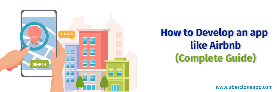
Let’s discuss how to develop an app like Airbnb.
Booking site Airbnb provides online hospitality services and holiday rentals. You can reserve rentals worldwide and filter the alternatives based on your preferences, financial situation, and convenience. It has achieved tremendous success thanks to its creative strategy and smooth operation.
You must comprehend Airbnb’s business model and features if you intend to build an Airbnb clone app. The business strategy is relatively straightforward and works for both people looking for housing and those looking to rent out their property. Users of this app can enter their information to view the possibilities available based on their preferences.
How does the travel app work?
There are two types of users in the travel application: those who want to rent a place (landowner or host) and those looking for accommodation (guests). The app has several features for both hosts and visitors and is built on a two-sided marketplace tech stack.
The functionalities of Airbnb
Profile administration: Hosts can change their information, including their email address, mobile number, account password, home address, languages, and payment methods. You can include the feedback too.
Generation of a list: In addition to listing the address, the type of lodging, the size of the space, number of guests, the quiet hours and other conditions, the payment information, and the rent, hosts must also post high-definition photos of their property and a description of it.
Requests: When everything appears to be in order, hosts can accept requests or reject those they don’t like.
Bookings: The host has the ability to access reservation data and tracks upcoming bookings. A host can track the previous payment too. The app can provide metrics and insights on the sales, profitability, dynamics, etc.
Chat: This feature enables the users and hosts to chat with each other.
Reviews and ratings: By allowing hosts to score their interactions with guests and provide reviews that other hosts can see before approving a guest, Airbnb protects its hosts.
Monetary system: Host cans view their transaction history in a user-friendly style.
Integration of social media: Additionally, hosts can use social media to request that their friends download the app or make reservations
If your budget permits, you can add a number of additional features to the initial or later iterations of your application to give it a competitive advantage. For instance:
- Hosts can include extra services like entertainment, excursions, workshops, nearby activities, etc.
- 360-degree virtual tours of lodgings.
- You can add a translation feature.
- User-generated content can help your platform become more well-known.
- Integrate augmented reality, such as the depiction of a property card when customers scan a QR code on a building.
Invariant principles of UI design
While developing an Airbnb clone app, you must follow the given instruction in the following lines to keep your UI design top-notch.
Attract attention with high-quality images
When thinking about travelling, many people probably think of a visual image before detailed plans or car rental information. Based on these trends, Airbnb utilizes graphical images. Images take priority over text in all content, including lists of hosts. Most of the layout is occupied by images, with bolded elements and buttons next to it, which makes it easier for users to click.
The header uses videos of Airbnb users experiencing different cultures and environments while travelling worldwide. That is what users want to see on their travel sites! Not only can you fill out the form to book a host, but you can also experience a real trip.
Simplify content
Airbnb’s site organizes all its content and focuses on the most relevant information. The data entry form is simple, and the buttons used by the host are easy to find.
The list structure is a neat design that makes browsing easier. The elements are arranged in a list structure on the page, and only margins are provided at both ends, so it is neat without extra information, such as advertisements.
The contrast between the background and the font is high, and the text of the content is a straightforward narrative. There is no lengthy text on the top page; each content consists of a simple image and bold text above it.
Emphasize the most important features
The website should be designed to provide easy access to the most common features. Think about the motives behind website visits.
For example, on Airbnb, users visit sites to find a host. Therefore, CTA (Call to Action) is used as follows.
- CTA is arranged in the centre of a top page, where a button guides users to the host destinations.
- The buttons on the search bar use a prominent pink colour. By placing a transparent black colour on the background of the search bar, the search bar is made more prominent as a CTA.
- Airbnb also provides easy-to-understand information for users interested in becoming hosts with a “Become a Host” button and a block element that shows host income.
Steps to create an app like the Airbnb
Let’s create an Airbnb clone app. The first is a wire frame. It helps you assemble the necessary elements for your layout.
Let’s build an app like the Airbnb site from a static wireframe:
Basic layout
This method starts by creating a layout skeleton. Known as Content wireframes, these boxes represent each element on the page of your site. In this step focus on the content and the visual hierarchy. Use these boxes to experiment with the placement of each element, like the navigation bar and headers.
By creating this skeleton, you can think about the overall layout without considering the actual design in detail. Once you’ve made a wireframe, you can practice iterations to create a complete wireframe or mockup.
- When creating a new design, it’s a good idea to connect the box-shaped wireframes with arrows to show the relationship and understand its structure.
- To modify the existing design, you can complete the basic design and can start the mockup process from the beginning.
Headline and header
Headings and headers are essential elements. The headline should have an expressive design that instantly grabs the user’s attention.
For example, Airbnb uses the heading “Live There.”
Then create the subheading “Let’s stay at a local host’s house and travel to live in more than 191 countries.” You can tell your users about the Airbnb experience and the convenience of being able to use it from anywhere.
The header image is what the user first sees. Images that are out of balance with the headline or distracting can lose the user. Use the appropriate header image for your page.
At Airbnb, the header uses videos of users travelling fascinatingly worldwide.
CTA
A CTA button is a button that encourages a user to click on a website and leads to an action.
By visually appealing in the form of a button, it has the effect of encouraging user action. To use the CTA button efficiently, it is effective to use techniques such as text, color scheme, and placement. When encouraging users to take some action, simply guiding them with text will have less impact. The CTA button is a clickable button format, so it is easy to appeal visually and lead to actions.
Read more : How to increase bookings with an airbnb clone script
Navigation bar
Although the navigation bar is small, but it is a helpful. . It is an essential part of your app because the navigation bar is generally the first thing visitors will use if they can’t find the information.
Limit the icon number usage in the navigation bar. Due to its restricted area, the user may become tired if too many icons are on it and it looks messy. All you need is enough items to guide the user.
For example, Airbnb is limited to four icons.
- “Become a host” is designed for about half of our users.
- “Messages” send important notifications to users.
- “Help” is a general guide.
- An “account” is for managing user information.
Make it an interactive design
The core of the user experience is interactivity. There are many ways to create an interactive design, but here you can add some work to the most critical elements of the CTA on the page. Creating a mockup does not require you to add interactivity to every element. It should be enough to imagine the completed site.
Add a drop-down menu to make it appear in a pop-up window so that it disappears when the user clicks the button or moves the mouse cursor over it. You may also try altering the button’s color when the cursor is over the search button.
Adding such a small device makes it easier for the user to notice the button. The image above is a drop-down menu added to “Destination” in the search bar.
Conclusion
Airbnb’s mission is to realize a world where everyone is everywhere. From log houses to castles, you’ll find millions of listings for your travel needs. Check out the description and photos, host profile, and guest reviews for listing details. And now you can do that too.
Fortunately, the software is cheaper. Located in the cloud, for rental, on all devices, it has no long-term contracts and is user-friendly too. It is a thriving market, and investing in an Airbnb clone app would be the wisest decision, as you can expect a higher ROI quickly. Contact UberCloneApp for more information.


